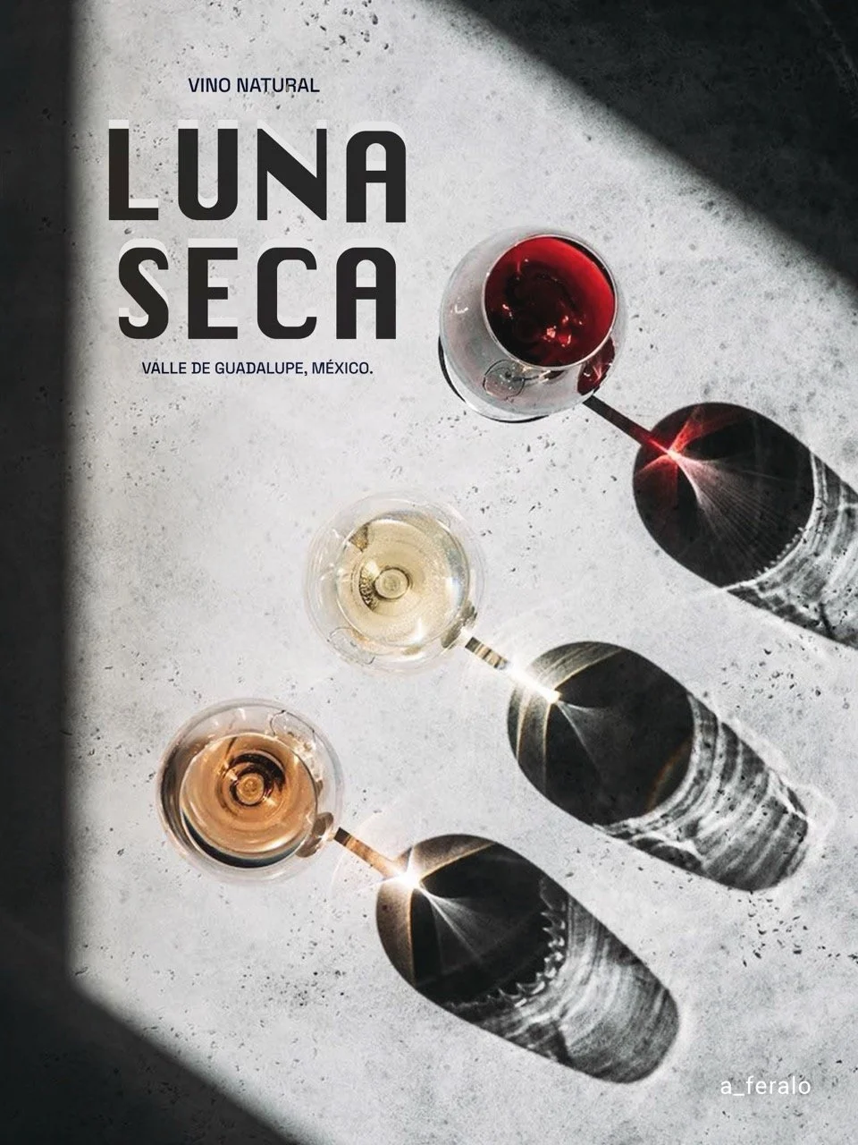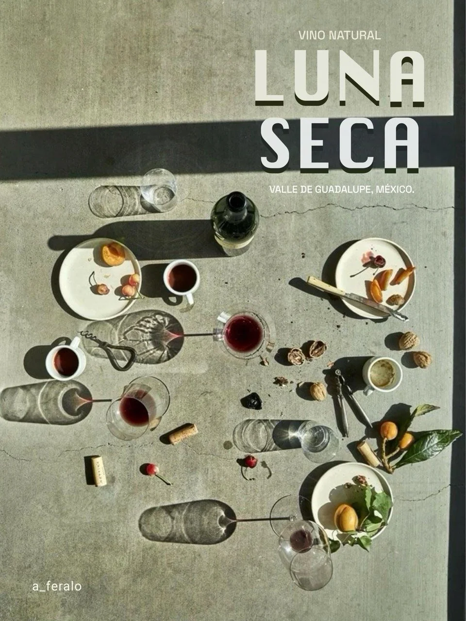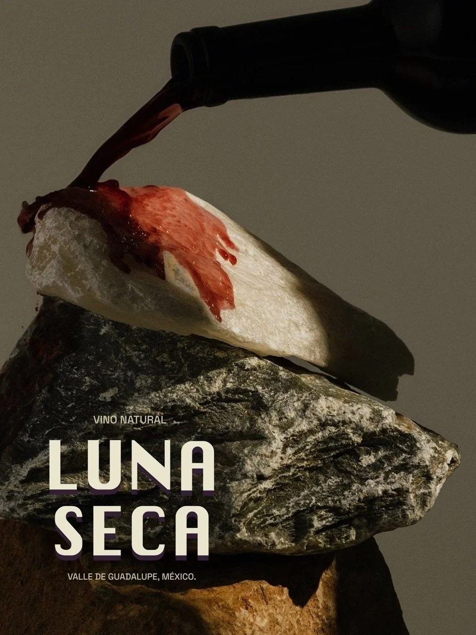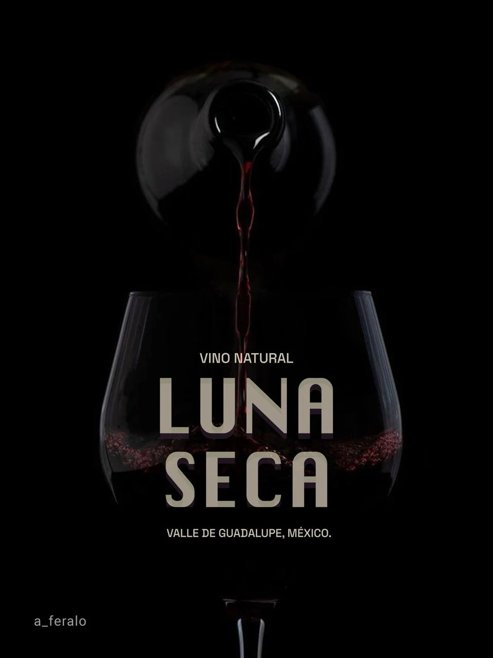
BRANDING / GRAPHIC DESIGN / VISUAL IDENTITY
MEXICAN NATURAL WINE BRAND
LUNA SECA
Client: Luna Seca.
Natural Winery, VG, Mexico.
[ About ]
Luna Seca is a winery dedicated to the artisanal production of natural wine, crafted through earth-respectful processes and a contemporary interpretation of the Mexican landscape.
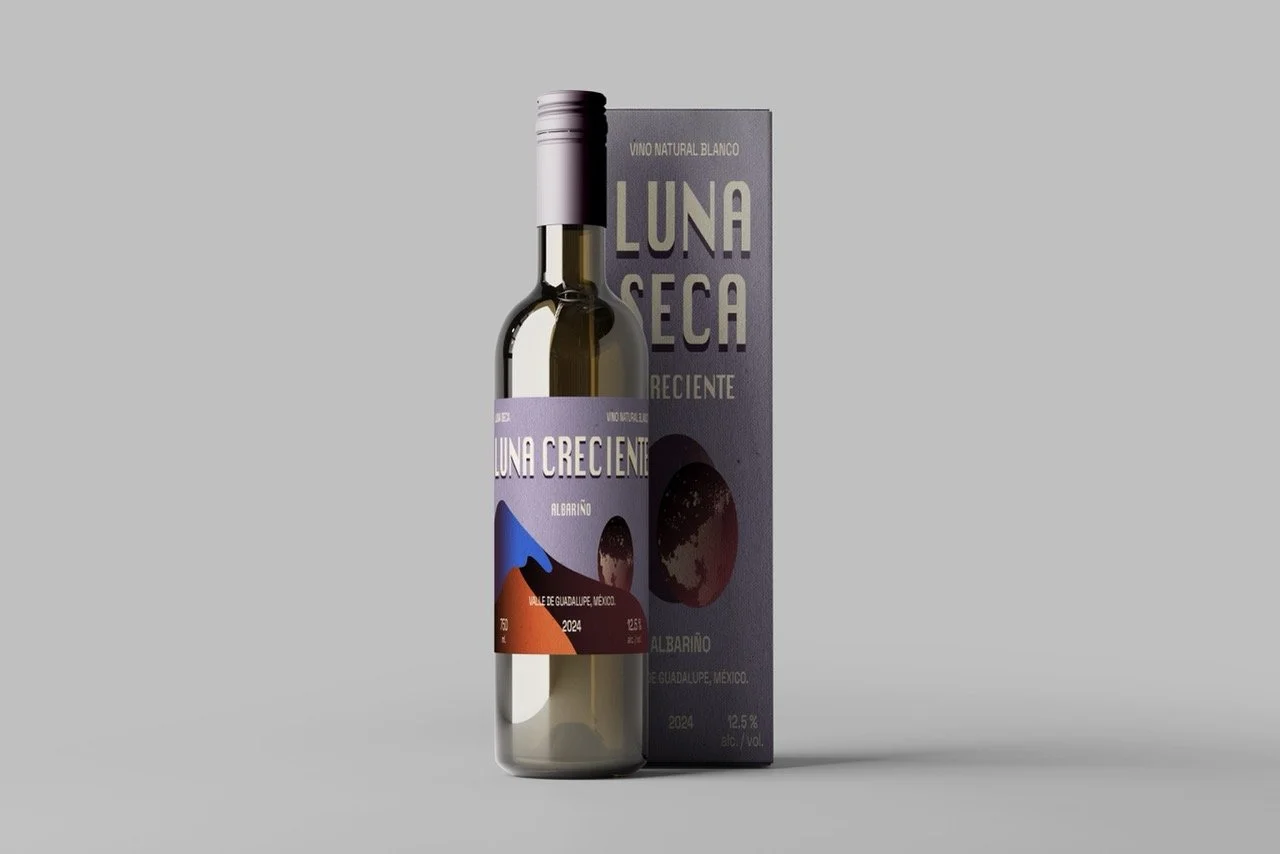
For this project, I developed a visual identity that subtly breaks away from traditional design codes within the wine industry. Instead of relying on classic or understated aesthetics, I chose an illustrative, colorful, and evocative visual language inspired by the arid and mountainous terrain of the Valley, the lunar cycles, and the organic energy that defines the winery.
[ VISUAL IDENTITY ]
The goal was to create an expressive, clear, and memorable identity, one capable of communicating the authenticity of natural wine through a freer, more imaginative lens rooted in a contemporary aesthetic that conceptually conveys the gentleness of the brand.
[ BRANDING ]
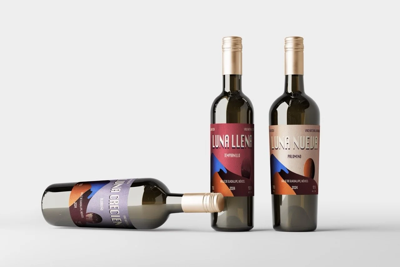
The brand is composed by 3 types of fine wine. Each wine in the collection carries its own visual identity shaped and reflecting its lunar phase and grape character.
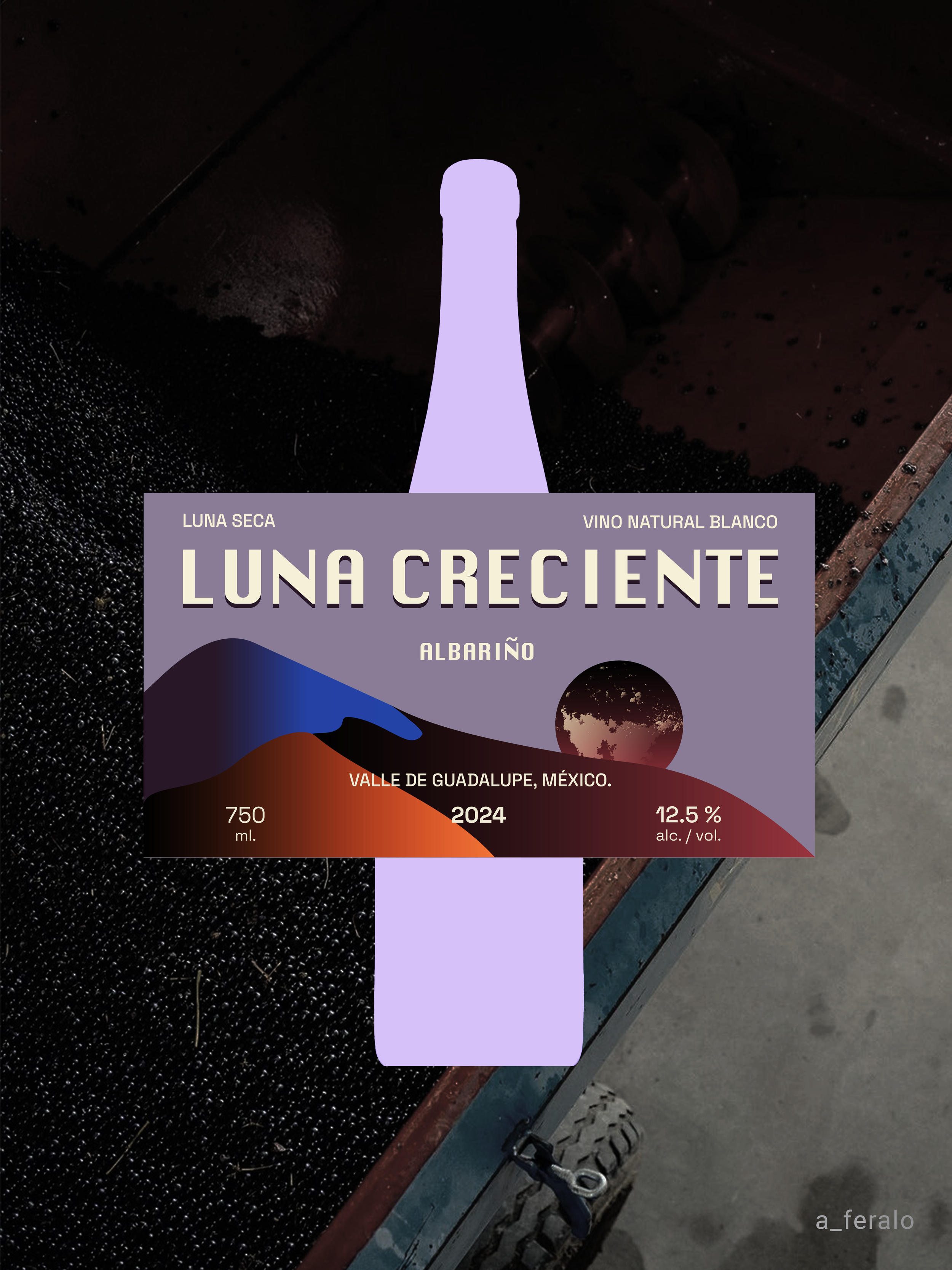
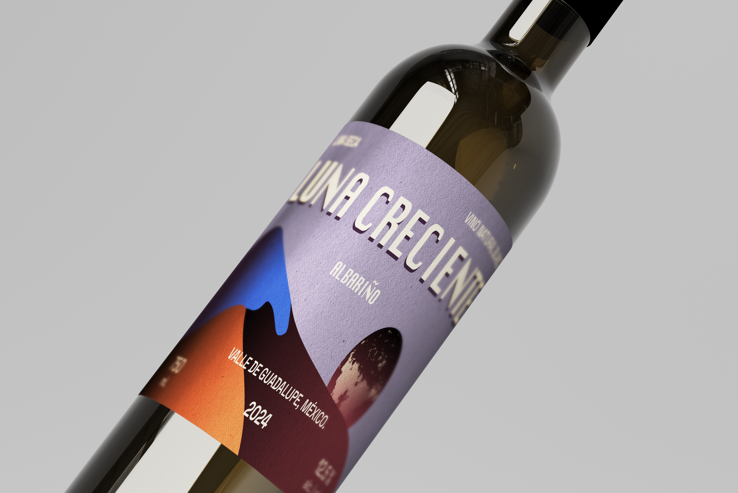
LUNA CRECIENTE ( Albariño )
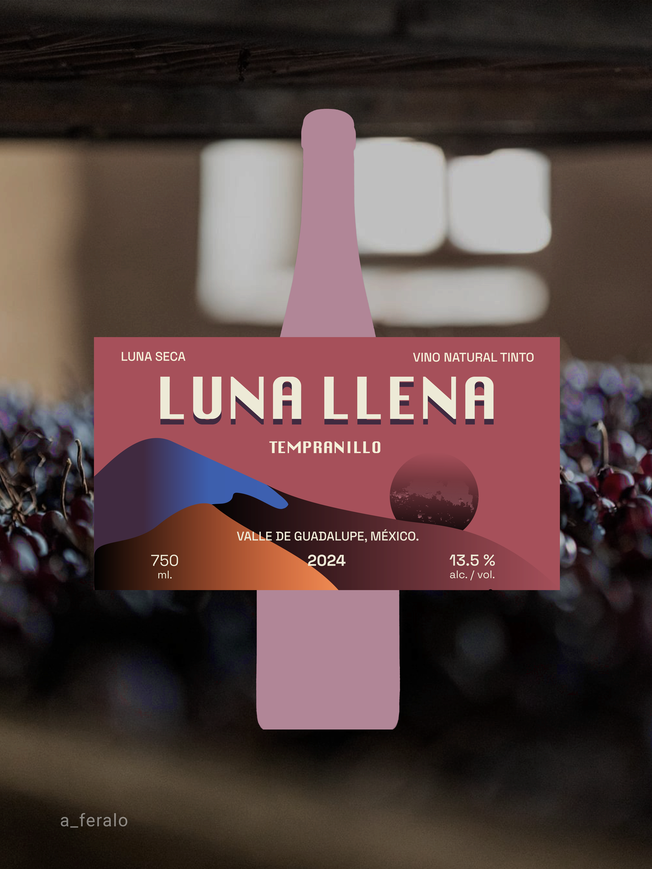
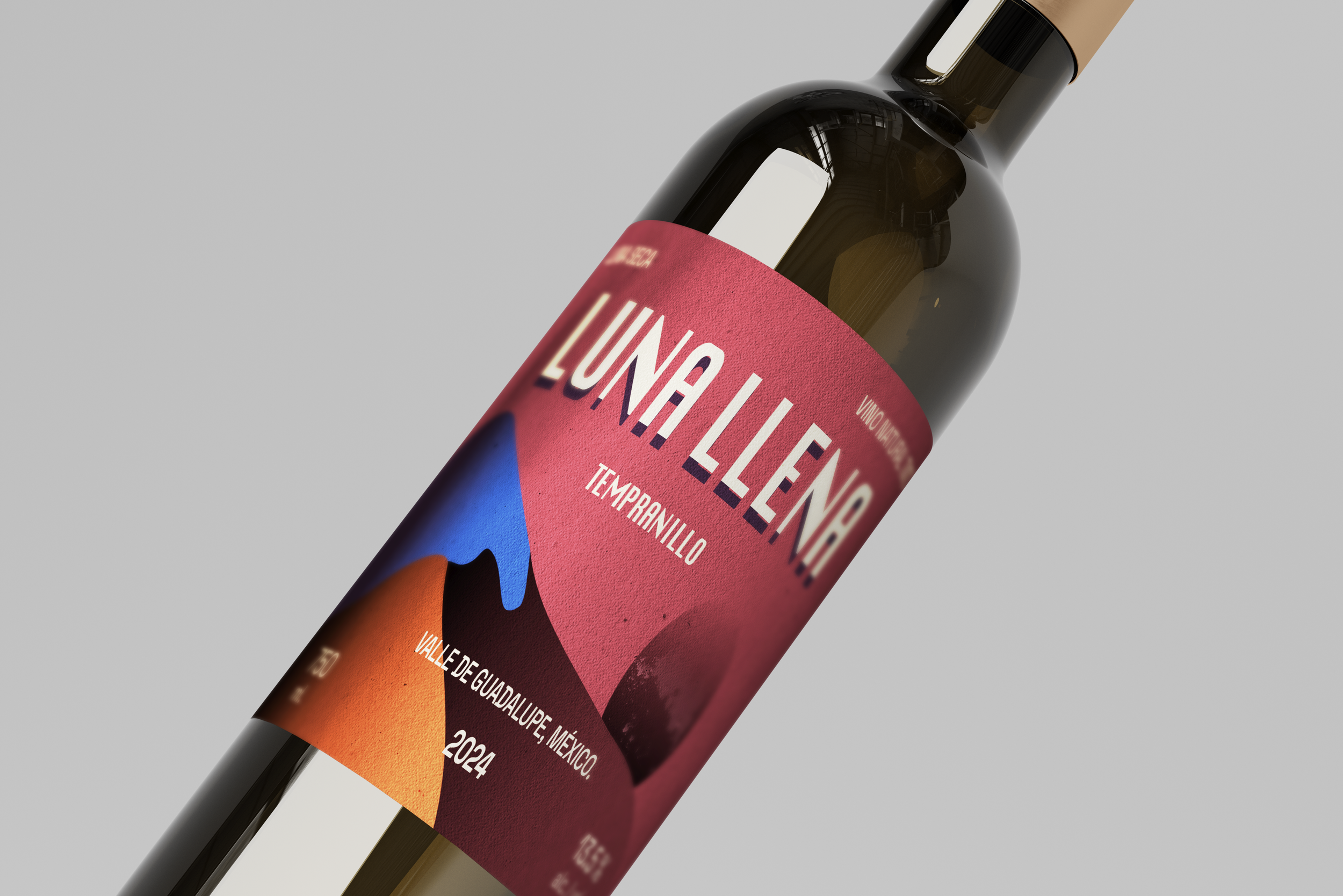
LUNA LLENA ( Tempranillo )
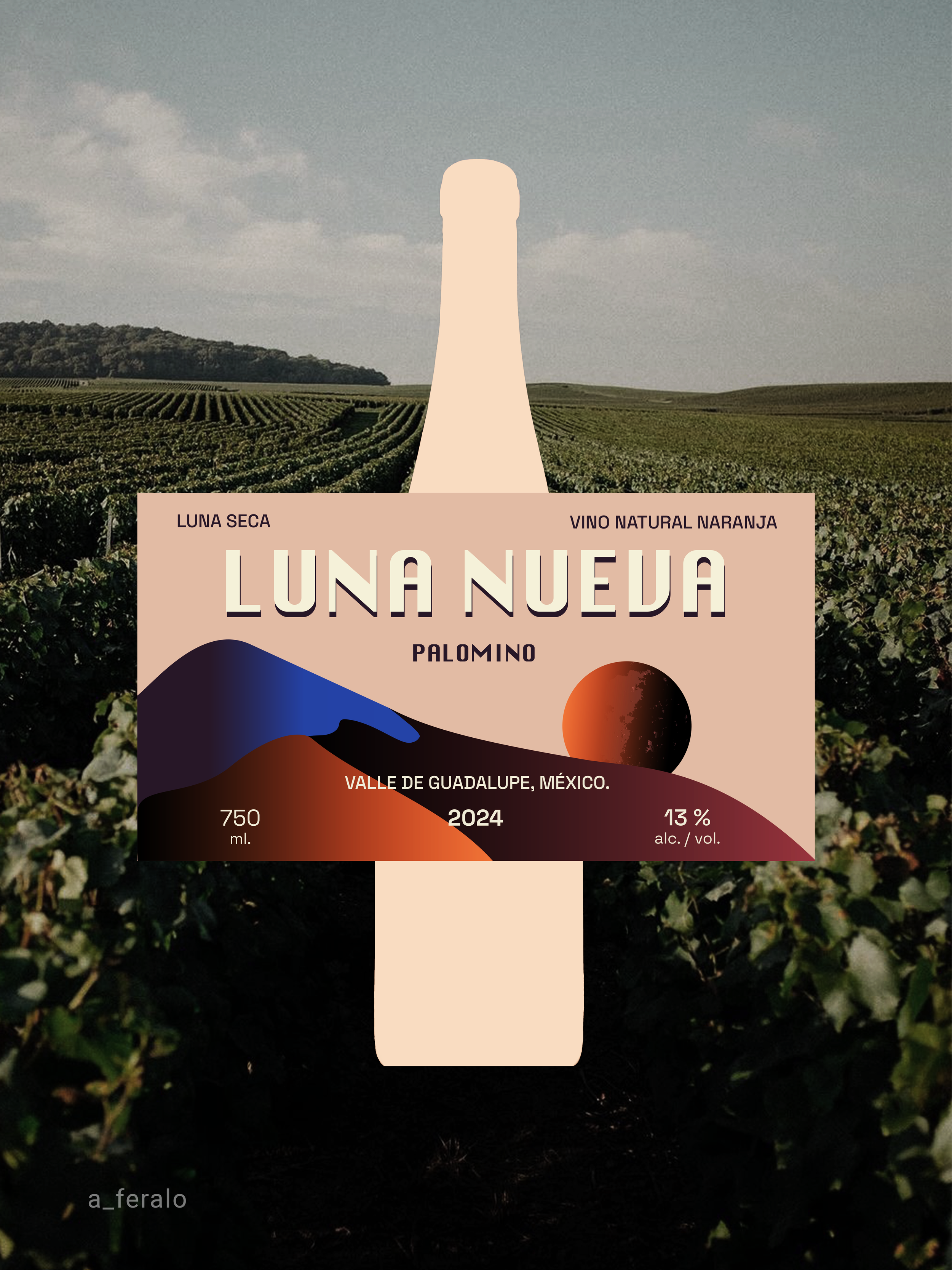
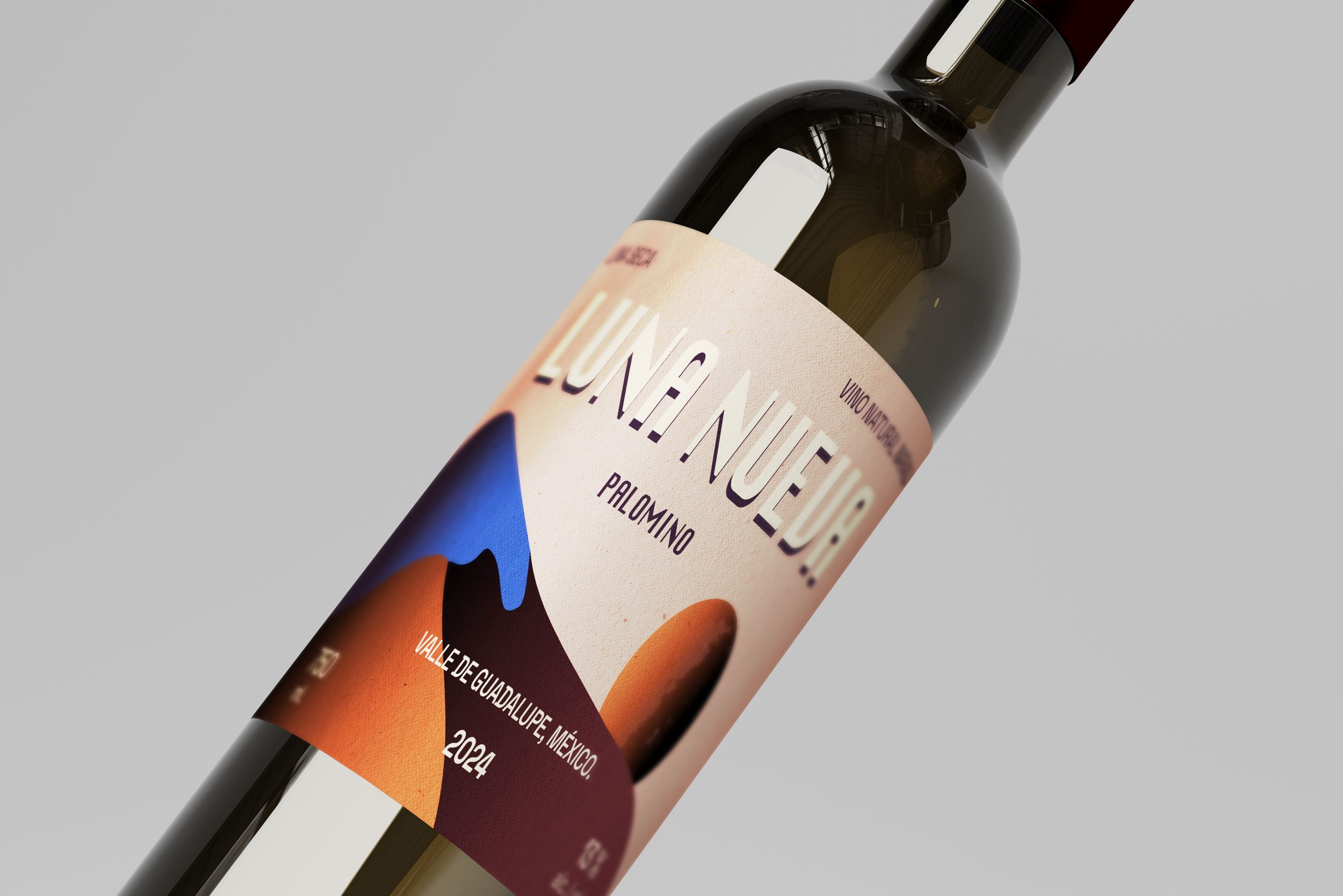
LUNA NUEVA ( Palomino )
[ PACKAGING ]
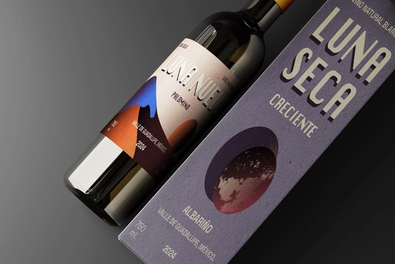
[ COLOR PALETTE / TYPOGRAPHY / SYMBOLS ]
Each associated with a different lunar phase. This structure allows for a cohesive yet dynamic visual system where color, organic forms, and narrative composition highlight the character of each variety.
This project proposes a visual direction that aims to open new possibilities within the wine sector, moving away from standard minimalism and embracing a bold, sensory, and distinctly Mexican identity.
[ NATURAL WINE ]